This idiom rocks. It is one of my favorites because of its intriguing historical origin.
Meaning
“Loose lips sink ships” is a figurative admonition to avoid careless talk, especially when you don’t know who is listening. In fact, if someone is talking about potentially sensitive information he may unintentionally do harm.
Origin and Etymology
The origin of this phrase dates back to World War II. During the 40’s a considerable number of American military vessels were destroyed and hundreds of American soldiers drowned. The U.S. Office of War tried to fight back the leaking of information by running a propaganda campaign with the goal of reminding Americans civilians and military personnel about the risks of speaking about national security issues that could be used by the enemy.
A notable number of artists and graphic designers involved in the campaign produced some historically interesting propaganda posters, now regarded as vintage pieces of art. The sentence “Loose lips sink ships” was originally plastered on one of those posters together with dozens of other posters with similar patriotic slogans (i.e. a brief, striking phrase that supports an idea).
In this post, I selected and collected for you some of those vintage posters (they're all in high-resolution, just in case you want to download them). I found each one of them extremely interesting from an artistic and historical perspective. In particular, a few elements called my attention:
- Posters have a strong emotional message that conveys the political message.
- Wartime propagandists leverage on commercial advertising techniques. Eventually, commercial advertising exploited the war propaganda as a vehicle of communication (as it happens in the poster from Stetson, see below).
- There is a qualitative artistic difference between the posters drawn by the US Office of War Information and those drawn by professional artists.
- During the 4 years of time (1941-45) in which these posters were issued, I note a progressive transformation in the graphic language. At the beginning of the period the graphics look more abstract and descriptive, while in the later period they tend to become more symbolic and the feeling of empathy with the observer is strengthened.
- British propaganda is more focused on women.
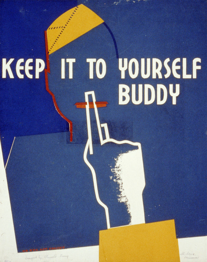
Keep it to yourself buddy (1941 ca). Designed by, R. W. Kraus - This is a direct message to the soldier.
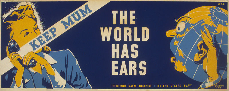
Keep mum. The world has ears (1941 ca). Designed by E. T. Grigware - In this case, the addressee is the woman talking on the phone.

Let me do the talking! Serve in silence (1941 ca.). Designed by H. Ansley - The addressee of this message is again the soldier.
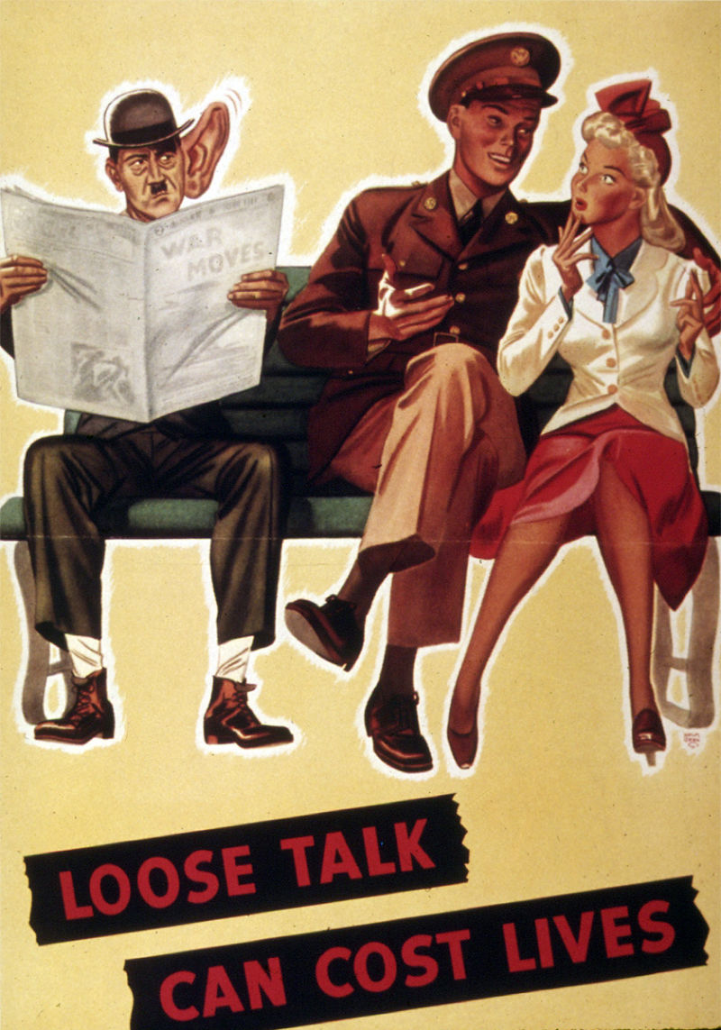
Loose talk can cost lives (1941 ca.). Designed by Office for Emergency Management (OEM). Office of War Information. Domestic Operations Branch. Bureau of Special Services - A soldier and his sweetheart are talking carelessly, while a Hitler caricature with a gigantic ear is eavesdropping on their conversation.

Loose Lips Might Sink Ships (1942). Seagram Distillers Corporation and designed by Seymour R. Goff. This is the original poster that gave birth to the idiom. The poster version is slightly different than the idiom and actually reads, "Loose Lips Might Sink Ships". The message is clear and direct without an interest in creating empathy. The red sky contributes in making the message more dramatic.
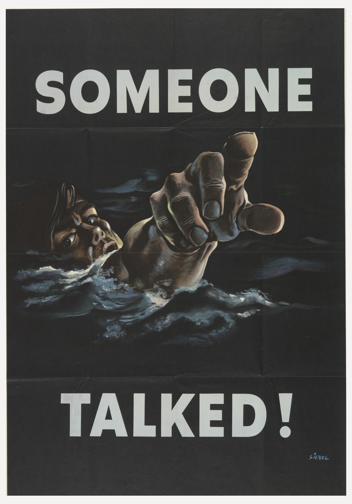
Someone Talked (1942). Designed by F. Siebel - This poster is on the addresses the same issue of the previous one, but with a psychological facet. The drowning man points his finger towards the one responsible for the security leak, creating a feeling of empathy.

A careless word...a needless sinking (1942). Designed by A. O. Fischer.

Protect his future...watch your tongue (1942). Designed by E. Christy.
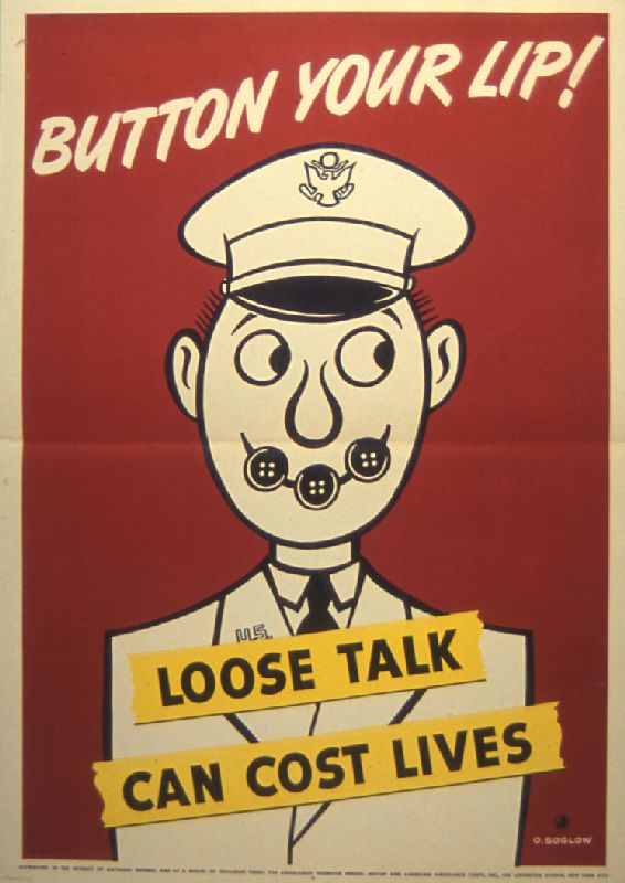
Botton your lip (1942). Designed by O. Soglow - “Button your” lip is another way to say “keep your mouth shut”.

He’s watching you (1942). Designed by G. E. Grohe - This is one the few cases in which the enemy is not hearing but watching.

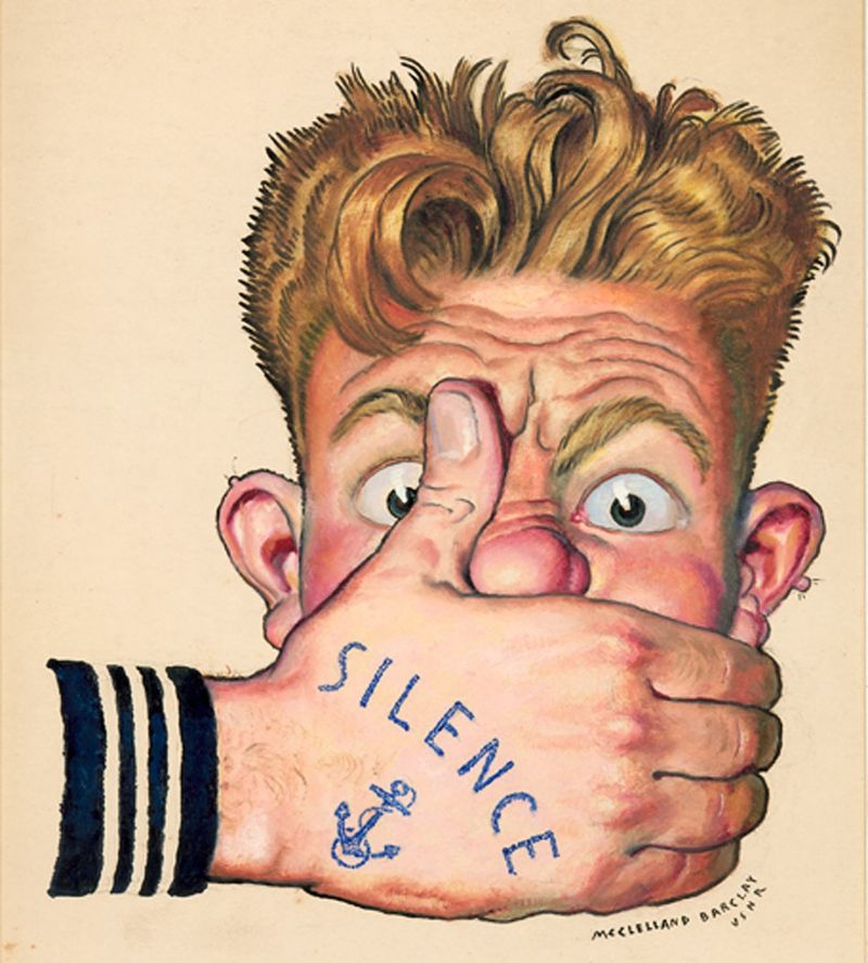
Silence (1942 ca), Designed by McClelland Barclay - I find this very cool because of the nautical tattoo on the hand of the US Navy soldier.

A careless word...a needless loss (1943). Designed by A. O. Fischer.

Keep it under your Stetson (1943 ca), Designed by “E. McKnight Kauffer ” - This poster is particularly interesting because the propaganda itself becomes useful for commercial advertising in this case for the famous American hat manufacturer.

A careless word...another cross (1943). Designed by J. Atherton.

“Censored” Let’s censor our conversation about the war (1943). Designed by Federal Art Project.

If you tell where he’s going...He may never get there! (1943). Designed by J. P. Falter.

Bits of careless talk are pieced together by the enemy (1943). Designed by Stevan Dohanos.

Award for careless talk: don’t discuss troop movements, ship sailings, war equipment (1944). Designed by S. Dohanos.

Less dangerous than careless talk (1944). Designed by A. Dorne.

Careless talk... got there first (1944). Designed by H. M. Stoops.
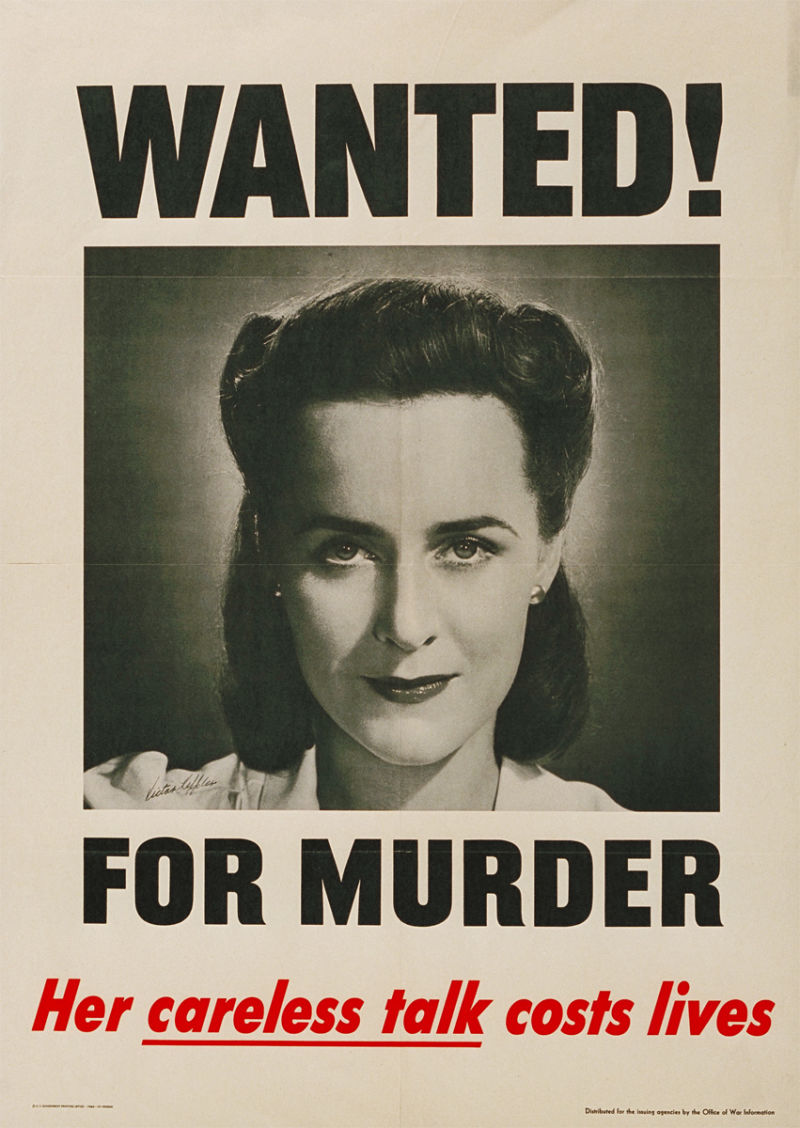
Wanted! For murder. Her careless talk costs lives (1944). Designed by V. Keppler. The woman is depicted as unable to keep sensitive information to herself and she is responsible for murder because of her careless talk.
Meanwhile in Britain and elsewhere in Europe, a similar anti-gossip propaganda was flourishing.
In Britain, there is a particular focus on women. The message conveyed would be often regarded as “non-politically correct” because women are depicted as weak, dumb or untrustworthy sexy spy.

Carless Talk Costs Lives (1940). Designed by Fougasse.

Carless Talk Costs Lives (1940). Designed by Fougasse.

Carless Talk Costs Lives (1940). Designed by Fougasse.

Careless Talk Costs Lives (1940). Designed by Fougasse. The British artist Fougasse drew a whole set of posters on anti-gossip propaganda.

Telling a friend may mean telling the enemy (1942 ca.). Designed by J. Weiner.

Seductive 'siren' (1942 ca). Designed by A. R. Whitear. The image depicts a glamor blonde woman in red. The sentence “You forget but she remembers” means that beyond the sexy appearance she might be a spy that could pass secrets onto the enemy.

Keep mum she’s not so dumb! (1942). Designed by G. Lacoste - The image depicts another apparently innocent glamorous woman surrounded by military officers carelessly talking while she is eavesdropping. The message implies that even she is an “innocent woman”, she is not so dumb as they would assume. In order to make the poster more eye catching the focus is all on the girl on the sofa.

You never know who’s on the wires. Be careful what you say (1939-45). Designed by unknown - Hitler perched on the telephone wires listening.
If this propaganda does not sound convincing for, look at a contemporary poster from Russia.

I can’t read Russian, I don’t know the date this poster was issued, nor I know the artist, but the message is clear and a bit intimidating.
Ludwig's wrap-up
I hope you enjoyed the poster gallery. While you should have learned how to say to button your lip in many different ways, now it’s time to go out and tell everyone about this cool post and Ludwig.